OTTR : A Transplant Patient EHR Application
Otherwise known as “How The Heck Do You Modernize Complex Software”.
(Please note that many of the things I designed were proprietary and can’t be shown publicly, so the visual artifacts are limited in places)
Ottr is a transplant care patient management software suite that has grown and evolved for well over a decade. I was brought in to solve two big issues:
1) The app needed to be modernized to be compatible with tablets
2) The visual architecture was not great, and navigation was confusing
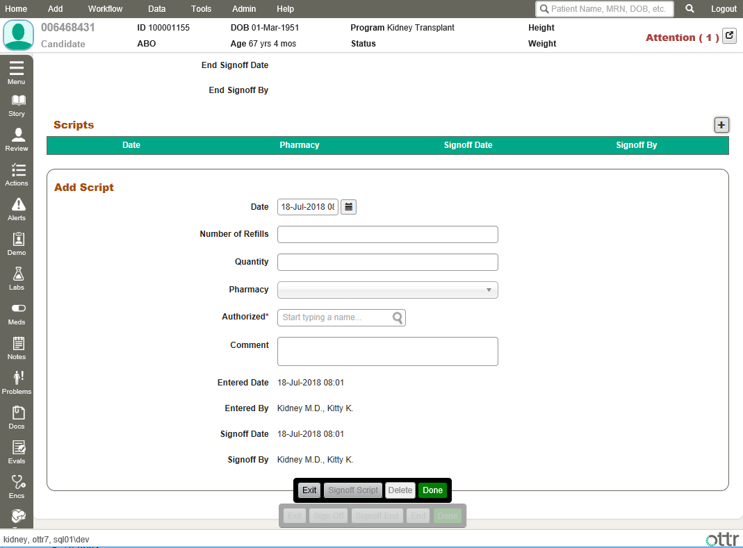
Here’s where things started… OTTR7
Why are the buttons stacked up like that? Why does the menu have a menu button? Why are the headers orange? I don’t know the answer to the first two, but the orange was because the product owner liked a certain football team…
The Problem
OTTR had never had a dedicated Product Designer. The UI was a result of several developer’s independent decisions over the years, and a mediocre attempt to port Windows 98-era design sensibilities into the modern age. Most screens are very data heavy, and while the interface was functional, it suffered from confusing navigation and poor data hierarchy. This meant doctors and staff took considerably longer to find or input data into the system.
More and more hospitals were also moving to tablets, and the application needed to support touch input and smaller screen sizes, which the current version did not.
The Requirements
Redesign the UI for quicker navigation and data input / acquisition
Make the interface flexible and scalable for use on desktop as well as tablet screens, and touch friendly (aka have alternate behavior for things like hovering to show)
Fix the long list of issues that were causing user confusion
Integrate several new features such as view history, multi-tenant providers and improved analytics reporting
OTTR 8 - A Breath of Fresh Air
The New Palette
Branding-wise, I didn’t make huge changes. This wasn’t supposed to be a full rebrand level of overhaul, so I simply tightened up the color palette and brought it all into the same tone family. No more orange, the greys were given a cool hue, and the colors were harmonized. The UI immediately felt far more cohesive.
Buttons and inputs were given more padding to make tapping easier on a touchscreen. Labels were moved to a condensed font so less real estate was consumed on the left side with the sizable forms on many pages. Again, more padding meant slightly larger elements, so we saved room on the labels. That helped keep our data dense without overcluttering the UI.
Conversations with stakeholders and users surfaced some interesting notes. Transplant care is a heavily regulated industry, so I had to learn about the regulatory forms and processes that underpinned the data collection. I discovered that many hospitals had only recently moved to a digital solution, and would still often revert to paper records if the servers or internet was down. Doctors often had memorized analog workflows, and we would create a far better user experience by mimicking those.
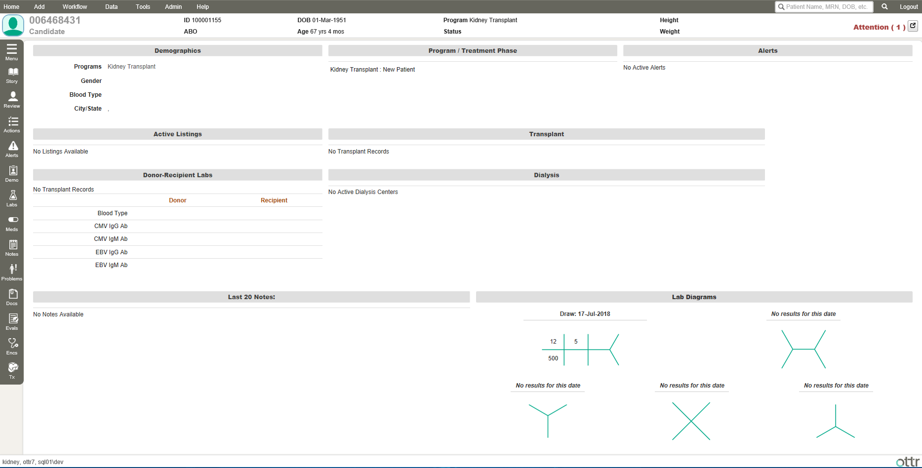
Design-wise, I went with a heavy emphasis on clarity and brand cohesion. My primary objective was speed of navigation and logical association of pages by topic, so the clinical staff wouldn’t need to think as heavily about where data was supposed to go in the system. Dashboard information was organized into discrete cards to make skimming faster, menus were refactored for better categorization, and several major elements were moved to make the layout far more mobile friendly by freeing up page real estate.
A specific example is the Patient Data Header seen below. I cleaned it up and zebra striped the sections for faster visual parsing and leveraged font weight to speed up skimming for specific info.
One of the new features added was a history function so staff could quickly return to a patient they had previously viewed.
I opted for a simple layout, showing name, DOB and image for rapid IDing of the patient, and under each a simple history of pages. An patient without an image would get a thumbnail with the first letter of their first name shown.
This feature is a great example of an industry-specific requirement I uncovered during the research phase: patients commonly have the same names, but name + DOB is typically unique enough for high-level IDing. MRN is the truly unique identifier, but lacks the rapid and intuitive validation of age + name, especially for in-person interactions.
Another feature that I architected was our Multi-Tenant system. Some hospital groups have multiple locations serving a common base of patients, so it was important to allow users to select which medical facility they were adding to or associating with patients and protocols.
Many parts of the system needed to be tagged with the location. I worked with a combination of icons and full location labels to communicate differing levels of detail. For example, several tables were given an icon indicating if the particular action/medication/patient etc. was in the same place as the provider currently or not. This approach saved valuable screen real estate instead of listing out the location’s full name in each row.
Users could use the main navigation dropdown to select the “default” location for their whole application experience while they were logged in, as well as choosing location on a page-by-page basis with the selector within the page for filtering just that information. Provider search fields were also divided by location for faster selection.
One of the major challenges with an EHR system is identifying and sanitizing patient data. And when you have thousands of data points to manage, it can be overwhelming and expensive to have someone manually check.
The Organizational Health Report I designed allowed medical professionals managing the system to quickly see every entry in the system that had something out of compliance. They could get high-level stats at a glance, satisfying macro reporting requirements. And any individual data category could be drilled into to expose exactly what needed attention and the ability to go to that form/page directly and fix it.
Outside of the design, I worked alongside engineering with React.js and .NET to build front-end components and help update the API to serve the data for the new features. I also collaborated closely with QA during testing sessions to confirm the designed features were implemented correctly and passing the final phase of usability checking.
In the end, I was able to create a save significant time for our client’s clinical staff. Navigating the system was sped up significantly and features like the view history created a major increase in quality of life for users. The work I did on modernizing the visuals also helped OTTR maintain its competitive edge in the EHR space and screenshots were featured frequently in pitch decks during the 2018 acquisition meetings (CareDX acquired OTTR shortly after).
I’m proud of the work I was able to do in such a life-changing industry. Transplant care ensures patients can live for years if not decades longer than they would have without the surgery, and our software helped doctors and nurses make that happen.


